
Since the release of Veeam Backup & Replication 12.1 it is now possible to view Veeam ONE dashboards right from the console. The new Analytics view provides 4 easily accessible dashboards to monitor backup infrastructure and data protection operations. Although these dashboards are available in Veeam ONE already, having them accessible directly within VBR console makes it much more convenient.
If you are running an environment with VBR 12.1 and Veeam ONE, setting up the Analytics view is a very simple and worthwhile process.
Enabling Analytics
First we’ll head over to the Veeam ONE client.
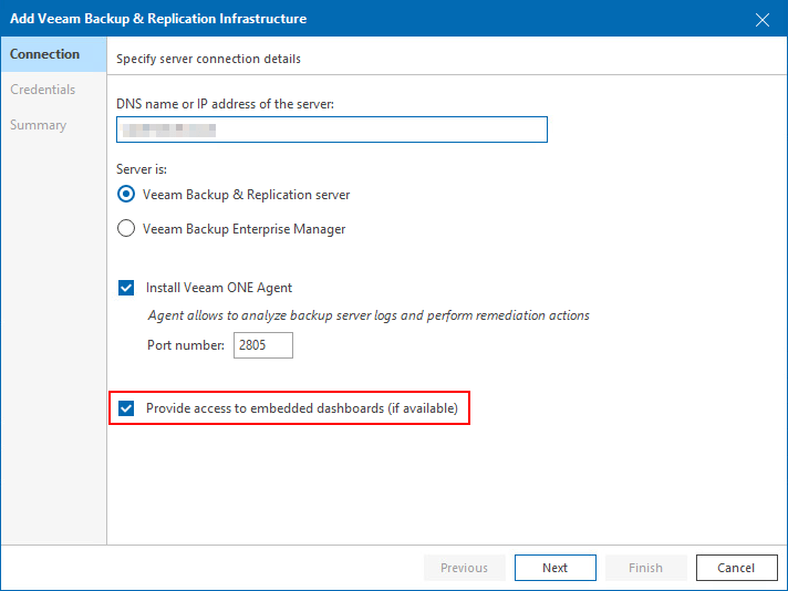
The main requirement is that the VBR server is added under the Backup Infrastructure node with the Provide access to embedded dashboards for added backup servers option enabled.
If you already have existing VBR servers added to the Backup Infrastructure node in Veeam ONE, you can confirm the setting by right clicking the VBR server then Connection Settings.
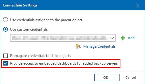
If the backup server hasn’t been added, use Veeam’s online documentation to add it before continuing. At step 3 of the add server wizard make sure to select the Provide access to embedded dashboards checkbox.
With that out of the way, the remaining steps can be carried out on the VBR server console.
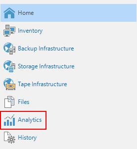
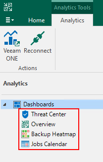
Click on the Analytics view.
The main window should look similar to the below image with the hostname of your Veeam ONE server shown as being monitored.
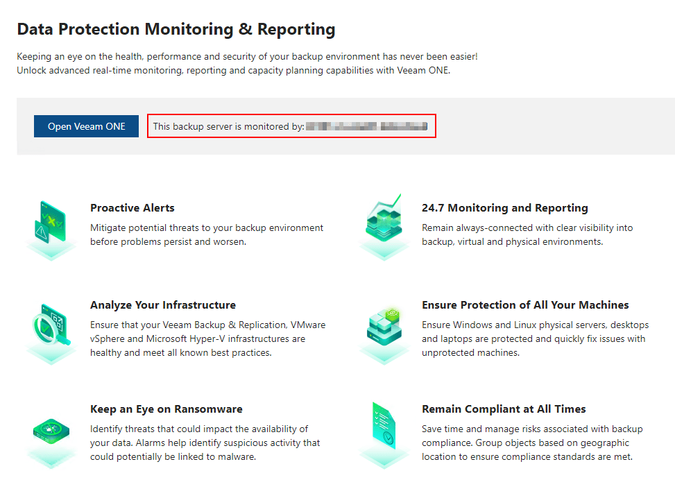
On the left under the Dashboards tree view are 4 available dashboards.
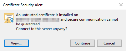
Upon clicking on any of the dashboards for the first time a certificate popup will appear. Click Continue to connect to the Veeam ONE server and load the dashboard.
Next let’s have a closer look at the different types of dashboards on offer.
Threat Center Dashboard
The Threat Center dashboard is designed specifically around the security of Veeam Backup & Replication. At a glance, it shows a high level overview of various security aspects broken into different widgets. Some of the widgets are interactive with additional information displayed on screen when hovering the mouse over certain sections.
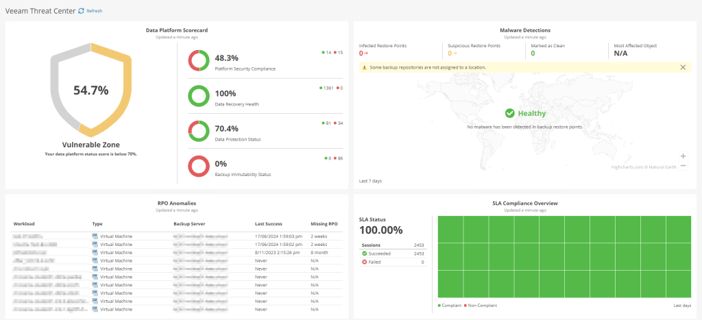
Data Platform Scorecard Widget
Provides a percentage based score from different areas of the platform in an easy to read format to quickly identify areas that need attention.
Malware Detections Widget
Shows an overview of restore points which are marked as suspicious or are infected by malware, broken down by geographic region.
RPO Anomalies Widget
Displays any objects that have not met their defined RPO.
SLA Compliance Overview Widget
Shows a percentage based view of your success/failure rate across all job sessions over a defined time period.
Overview Dashboard
The Overview dashboard focuses on providing information about the components within the Veeam infrastructure, with a focus on efficiencies and capacity planning.
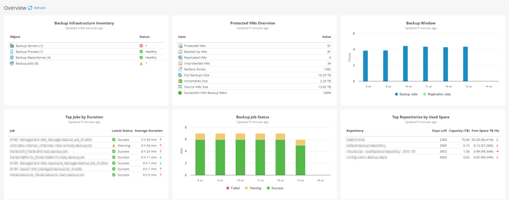
Backup Infrastructure Inventory Widget
Displays the backup infrastructure grouped by component as well as backup jobs including their health state.
Protected VMs Overview Widget
Shows information about protected VMs including a breakdown of the backup sizes and restore points.
Backup Window Widget
Shows the total duration of backup job sessions for each day. The bars in the graph are interactive, showing more information when hovering them.
Top Jobs by Duration Widget
Displays the top 10 backup jobs based on the longest average duration including an arrow graphic to indicate whether the job is taking more or less time when compared to previous sessions.
Backup Job Status Widget
Provides a daily summary of backup job completion status. Again, the bars in this graph are also interactive when hovered over.
Top Repositories by Used Space Widget
Displays the top 10 backup repositories that will run of out space the soonest, displaying the amount of free space remaining and how many estimated days until all space is consumed. Each entry includes an arrow graphic to indicate whether the free space is higher or lower than it was previously.
Backup Heatmap Dashboard
This is one of my favourite dashboards in the list. All of the widgets are interactive with the ability to get more granular information from the graphs when needed (more on that below). This is a great dashboard to use particularly when investigating bottlenecks within your infrastructure. While it is possible to do this using the log files without Veeam ONE, I find the visual approach much much easier and quicker to work with.
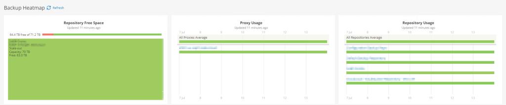
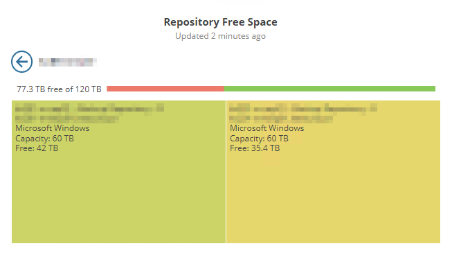
Repository Free Space Widget
A tree map shows the amount of free space on each configured repository with green being mostly free and red nearly full. The screenshot above doesn’t have many repositories configured to showcase this very well but the example screenshot below should give you a better indication.

If you make use of SoBRs in your configuration, it is also possible to click the associated square to show a usage breakdown of each of the extents which I find to be very useful.
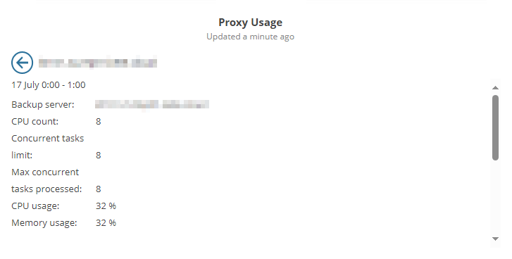
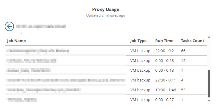
Proxy Usage Widget
Displays a full breakdown of concurrent tasks for proxy servers. The bar graph shows a 7 day view broken down into individual days. The graph uses a traffic light colouring system with green indicating either none or very few concurrent tasks running during that time, while red shows the proxy is close to or reaching the maximum number.
The first row shows the average statistics across all proxies configured on the backup server. Hovering over the bar on any given day shows a little more information including the number of tasks and how busy the proxy was as a percentage.
Below that are the individual proxy servers. The same information is available here when hovering over the bar however now we have the ability to click anywhere on the bar itself to zoom into a more detailed time based view. This gives you the ability to quickly identify any times during the day where the proxy may be overloaded.
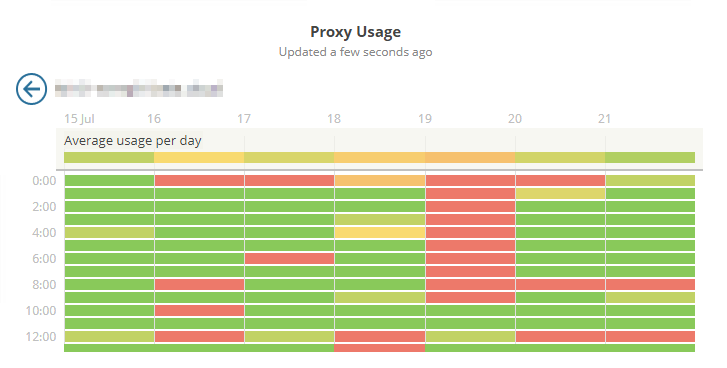
We can even go one step further here by clicking on a cell to see a usage breakdown along with a list of jobs that were running during that time period along with their task count – very useful indeed!
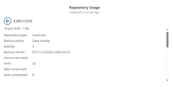
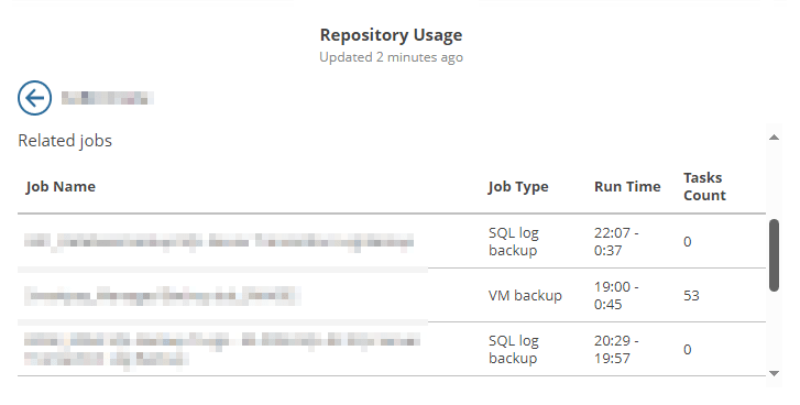
Repository Usage Widget
This widget is very similar to the previous proxy usage widget however as the name suggests, it instead relates to repositories. The same interactions apply here meaning it is possible to look at a breakdown of usage during any given time in the past 7 days and also a more detailed view of the repository during that time.
Jobs Calendar
This is another great dashboard which I find especially useful for larger environments containing lots of backup jobs. Providing an overall view of all your schedules for both past and future jobs, this dashboard has so much to offer.
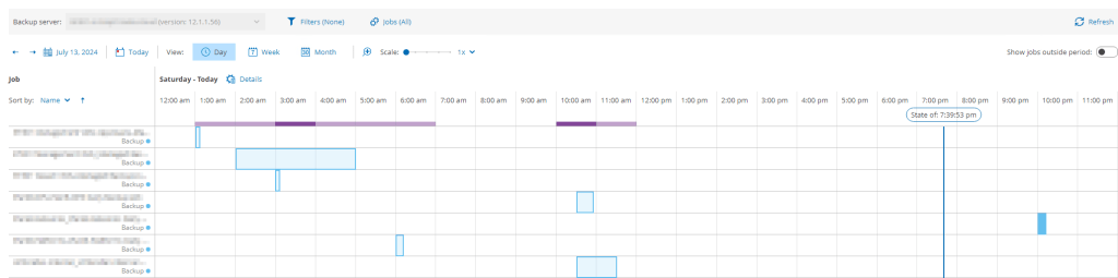
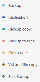
Starting off with the main window, you will see a list of all jobs to the left. To the right of that is the calendar view which by default shows job information for the current day. Jobs that have already completed will show their duration in the scheduler indicated by the coloured sections. Depending on the type of jobs you run in your environment, the colours of these will indicate the job type making them a little easier to differentiate from one another.
It’s worth mentioning that not all job types are available in the dashboard. I’m hoping that these will get added in the near future.
- Veeam Backup for Nutanix AHV jobs
- Veeam Backup for AWS jobs
- Veeam Backup for Google Cloud jobs
- Veeam Backup for Microsoft Azure jobs
- MS SQL plug-in backup jobs
- CDP policies
- Transaction log backups
- Veeam Backup for Microsoft 365 jobs
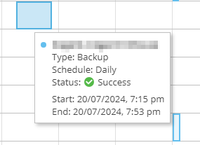
Hovering over any of the entries in the calendar will show you a brief view of the job result.
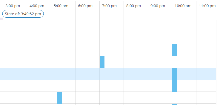
Any jobs that are scheduled but yet to run are shown to the right of the current time, indicated by the State of line.
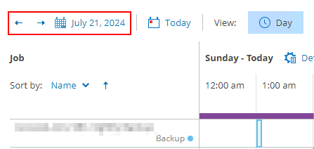
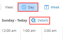
If you want to look at jobs outside of the current day either past or future, use the date picker tools in the top left. As you can see from the screenshot below, there is also a handy Today button which takes you straight back to the current day view.
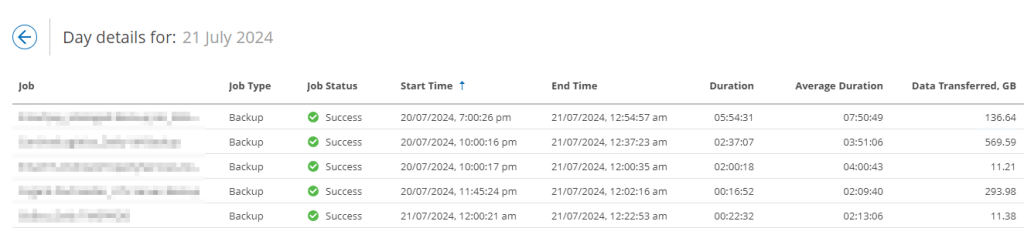
If you’d prefer to see the backup jobs in a list format, we can do that too! While in the day view click the Details button.
The backup jobs that ran on that particular day are displayed in a format reminiscent of the History view you are probably used to. The columns here can be manipulated by sorting and also filtered using the ellipsis button on the far right.
Apart from the day view, there are a few other views available including a week and month view, should you want to see the job schedules over a longer time period. The scale (available in day and week views only) is a good option when you have several jobs running over a certain period and need to zoom in for more clarity.

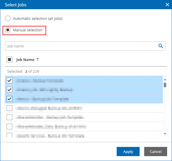
Seeing all your jobs from a single view is great but what if you have a large environment containing hundreds of jobs for example? That is where the power of filtering comes into play. There are 2 filter buttons available at the top of the dashboard.

The first one allows you to filter by workloads and/or job types. The second filters by job, with the option to manually select the jobs you want to see. Combining these gives you the power and flexibility to completely customise the view to your preference.

One thing I do find this dashboard useful for is scheduling new jobs. Sometimes it can be challenging trying to identify a good time to run a job in an environment where many already exist. Scrolling through a list of jobs in a regular VBR console can be a struggle and this is where the jobs calendar really excels.
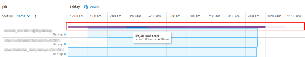
Using either the day or week view you can quickly identify the busiest and quietest times across the entire environment by using the purple bar in the calendar view, located just above the first job. The darker the colour within a particular time segment, the more job sessions are running. Hovering over the bar in a segment indicates exactly how many jobs were running during that period.
Wrap Up
Hopefully this shows how useful these dashboards can be as well as how easy it is to configure. I think having these dashboards available at your fingertips within the VBR console is hugely beneficial, making certain tasks much simpler while enhancing the overall user experience. There was once the perception perhaps that Veeam ONE is an optional add-on to Veeam Backup & Replication however with this latest integration, it feels like they compliment each other more now than ever.

Leave a comment